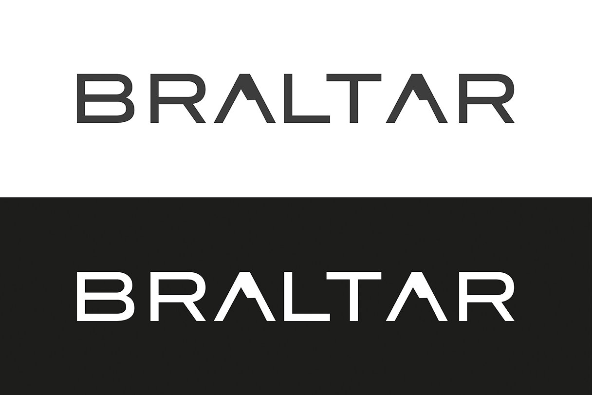
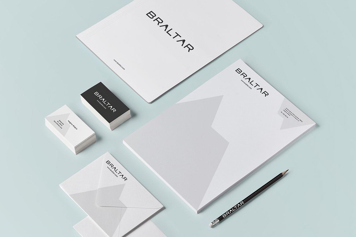
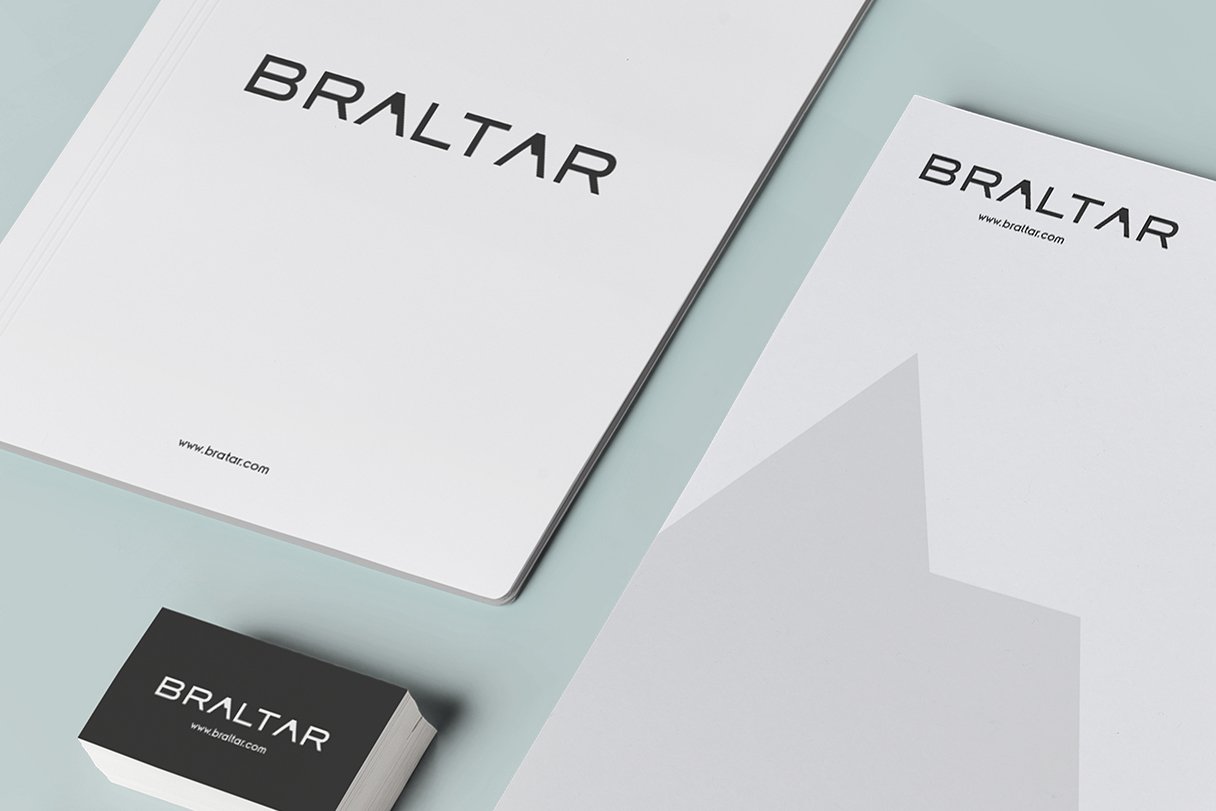
Braltar
This client is a marketer and distributor of spirit drinks that had the need to develop a corporate image. Its name refers to the rock of Gibraltar, which led me to design an abstract image of the shape of this rock integrated with the typography. The same graphic element was used in their stationery and business cards. The logo had to convey seriousness and elegance so that´s why I chose a neat typography and shades of gray.