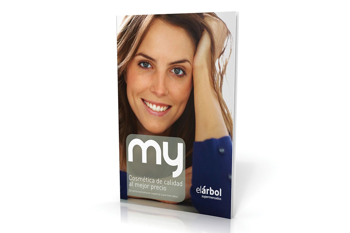
My catalogue
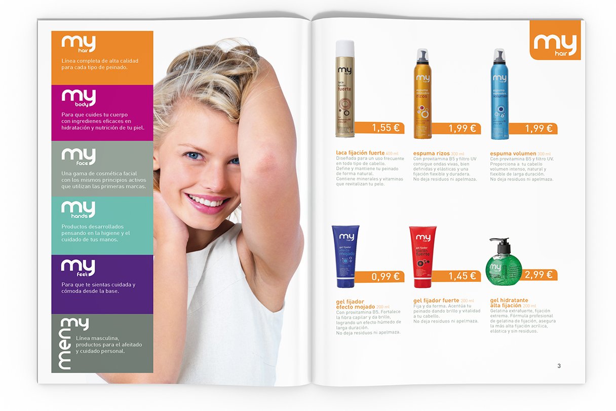
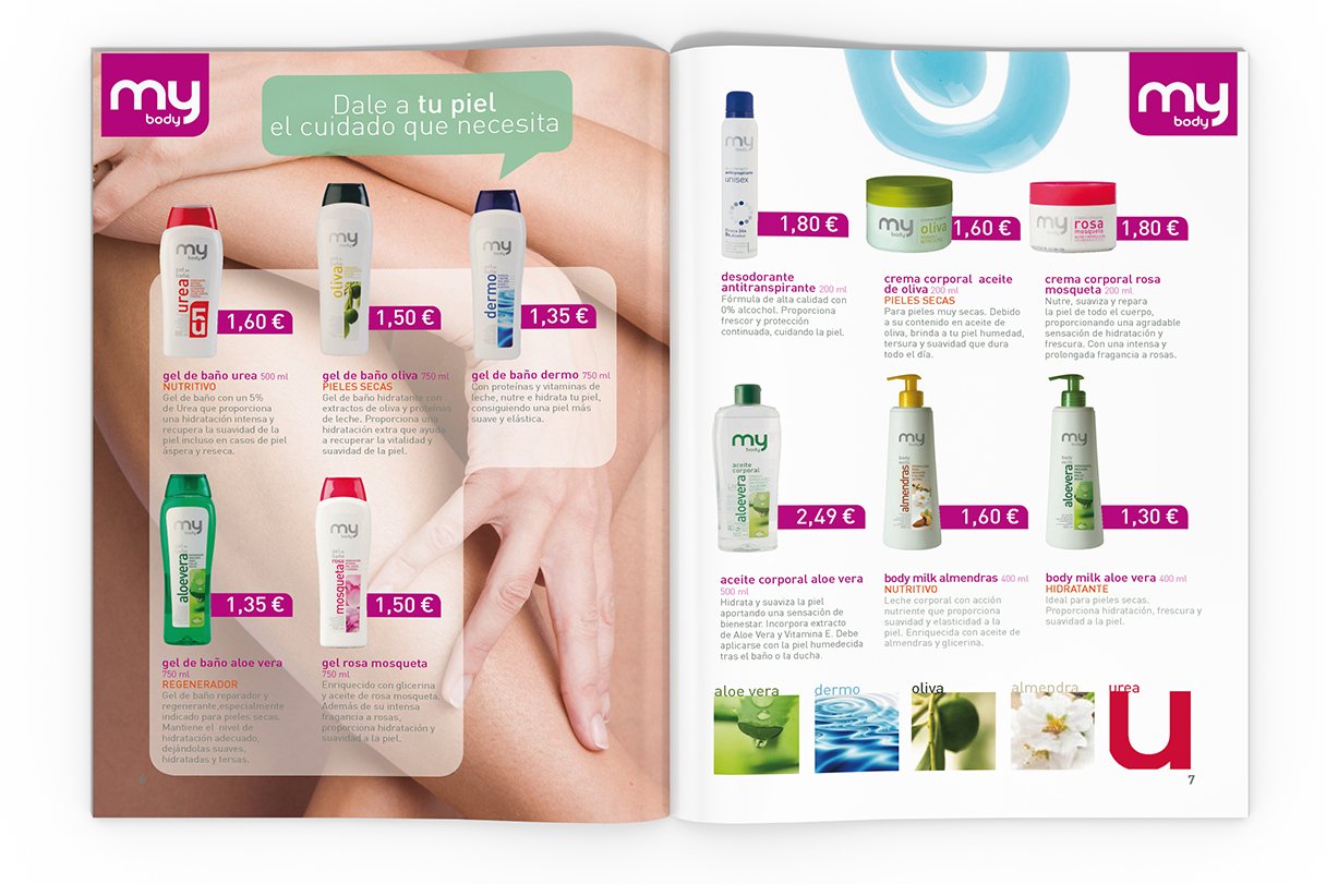
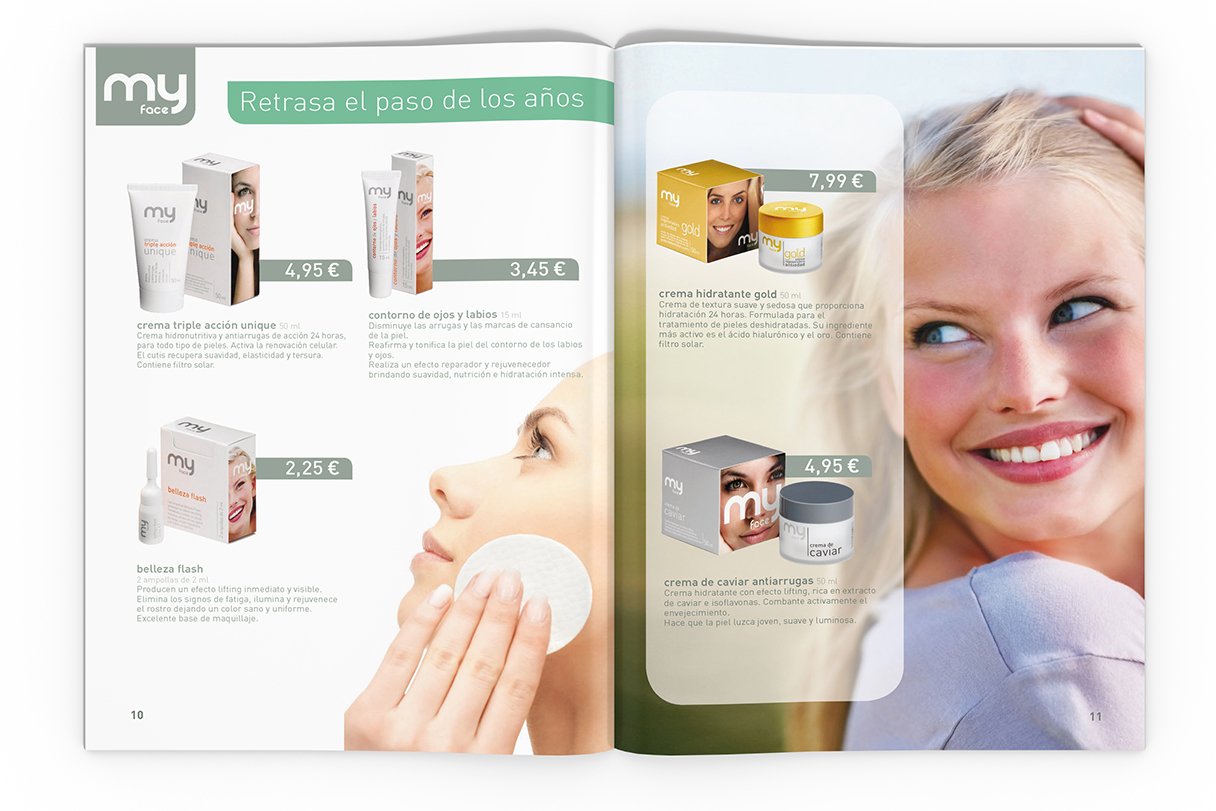
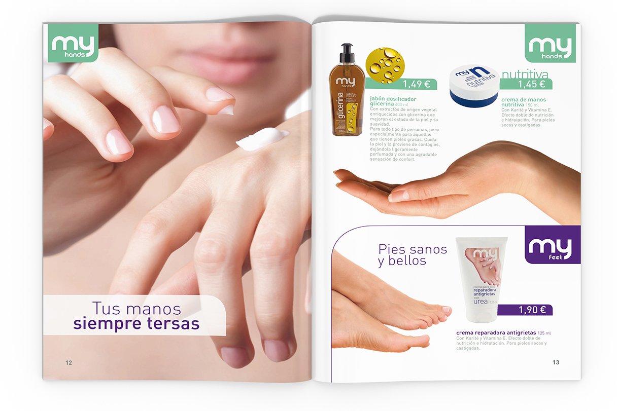
Since it is a cosmetic catalogue, the design is very neat. It has enough space to let all the elements breathe. All the products are classified in families and for each family I assigned a different color. The pictures used are bright and fresh to give the feeling of freedom.
For the layout I chose a modular grid for its flexibility, as the content could be modified by adding or removing products.
