Ser Coach Profesional
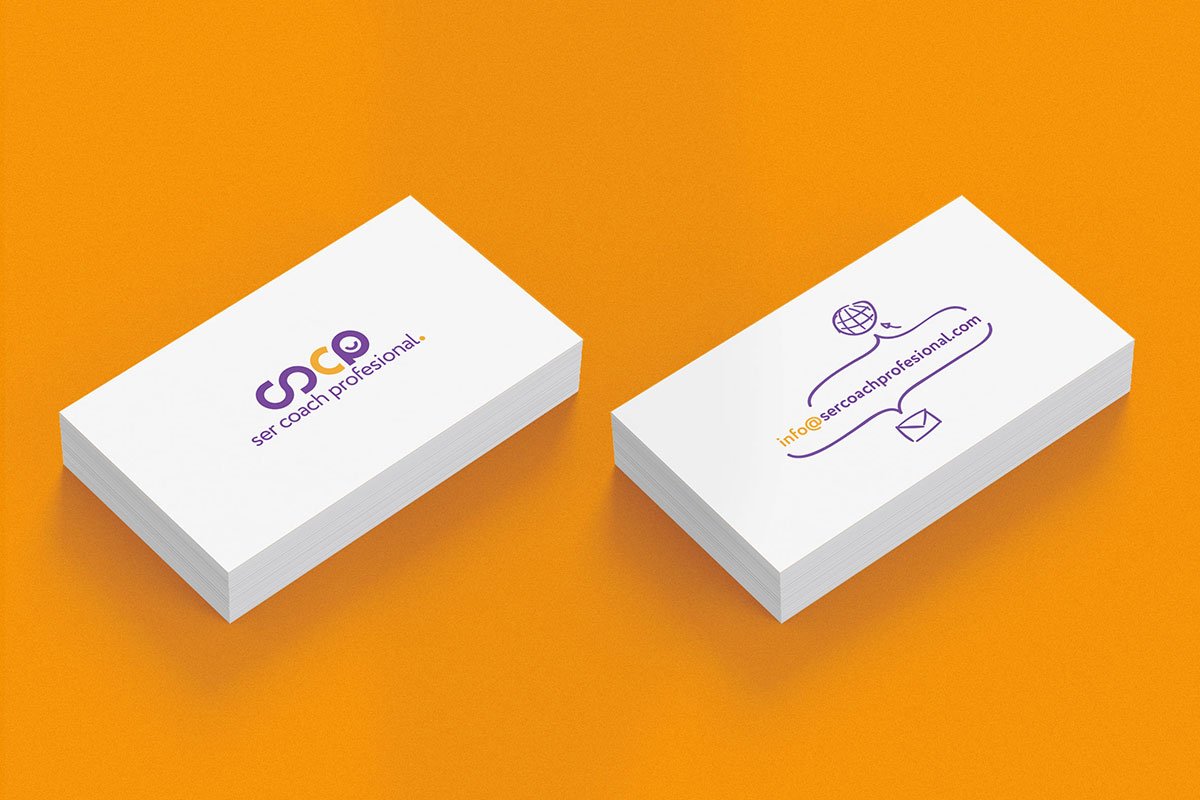
Professionalism, optimism and evolution. That’s what the client, a trainer for coaches, was looking to communicate with the brand identity. The process was a bit different than usual, because it was about developing a personal brand, not a company one. Therefore, it was important to take into account personal factors such as personality, likes and dislikes, goals, etc.
I tried to get as much details as possible about the person behind the brand. The result is a logo with vivid and contrasting colors that complement one another and blend well together. This smiling brand has simple shapes and rounded fonts to make it look neat, smooth and friendly.
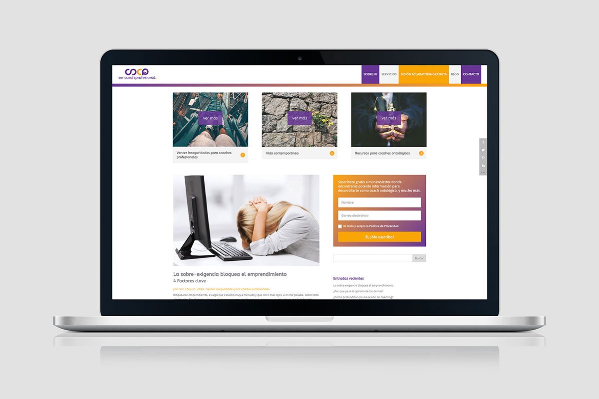
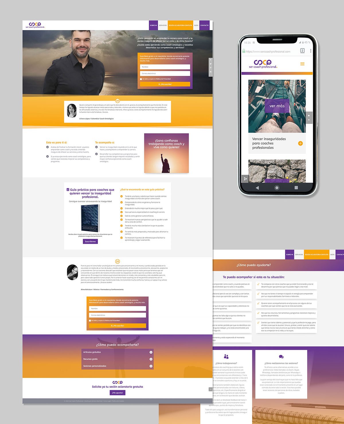
The website reflects the essence of the brand by its neatness and color scheme. Its structure has a good flow and functionality. Every element is placed to make the user feel comfortable and welcome.